Flexbox stands for flexible box. It’s a layout module for CSS aimed at giving you an efficient way to arrange, organize, and size website elements to create highly adaptive designs. The way flexbox works is quite simple on the surface: You have a container (flex container) with children (any elements contained within, called flex items), which are placed along flex lines.
The Flexible Box Layout Module, makes it easier to design flexible responsive layout structure without using float or positioning.
To enable flex container we need to set display flex. This defines a flex container; inline or block depending on the given value. It enables a flex context for all its direct children.
.container {
  display: flex;
}
Now we will understand different properties of flex with the help of images and code and less theory.
Table of Contents
1. justify-content:
justify-content aligns items horizontally and accepts the following values:
flex-start: Items align to the left side of the container.flex-end: Items align to the right side of the container.center: Items align at the center of the container.space-between: Items display with equal spacing between them.space-around: Items display with equal spacing around them.
1. flex-end: Items align to the right side of the container.

Guide this frog to the lilypad on the right by using the justify-content property, which aligns items horizontally

.container {
  display: flex;
  justify-content:flex-end;
}
2. center: Items align at the center of the container.

Use justify-content again to help these frogs get to their lilypads.

.container {
display: flex;
justify-content:center;
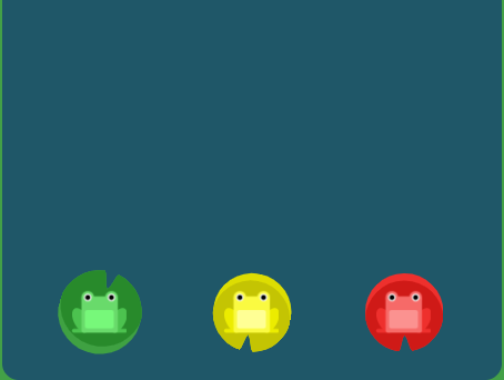
}3. space-around: Items display with equal spacing around them.

Help all three frogs find their lilypads just by using justify-content. This time, the lilypads have lots of space all around them.

.container {
display: flex;
justify-content:space-around;
}
4. space-between :

Now the lilypads on the edges have drifted to the shore, increasing the space between them. Use justify-content. This time, the lilypads have equal spacing between them.

.container {
display: flex;
justify-content:space-between;
}
2. align-items:
align-items Aligns flex items along the cross axis and accepts the following values:
flex-start: Items align to the top of the container.flex-end: Items align to the bottom of the container.center: Items align at the vertical center of the container.baseline: Items display at the baseline of the container.stretch: Items are stretched to fit the container.
1. flex-end

Now use align-items to help the frogs get to the bottom of the pond. This CSS property aligns items vertically and accepts the following values:

.container {
display: flex;
align-item:flex-end;
}
2. Center

Lead the frog to the center of the pond using a combination of justify-content and align-items.

.container {
display: flex;
justify-content:center;
align-item:center;
}
3. flex-end and space-around

The frogs need to cross the pond again, this time for some lilypads with plenty of space around them. Using a combination of justify-content and align-items.
.container {
display: flex;
justify-content:space-around;
align-item:flex-end;
}
3. flex-direction
This CSS property defines the direction items are placed in the container, and accepts the following values:
row: Items are placed the same as the text direction.row-reverse: Items are placed opposite to the text direction.column: Items are placed top to bottom.column-reverse: Items are placed bottom to top.
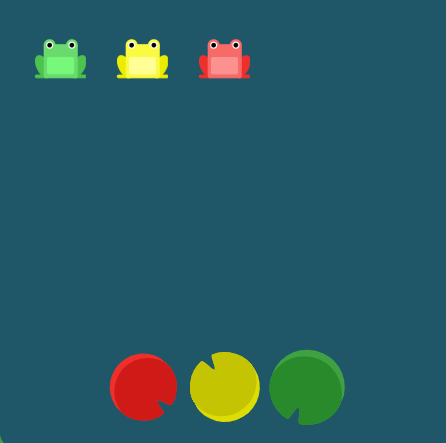
1. row-reverse

The frogs need to get in the same order as their lilypads using flex-direction.

.container {
display: flex;

flex-direction:row-reverse;
}
2. column
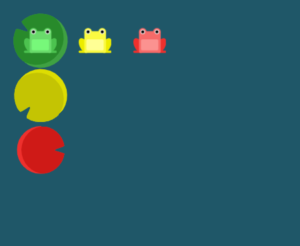
Help the frogs find their column of lilypads using flex-direction

.container {
display: flex;

flex-direction:column;
}
3.column and flex-end

Help the frogs get to their own lilypads. Although they seem close, it will take both flex-direction and justify-content to get them there.

.container {
display: flex;
flex-direction:column;
justify-content:flex-end;
}
when you set the direction to a reversed row or column, start and end are also reversed.
4. column and flex-end

Help the frogs find their lilypads using flex-direction and justify-content.

.container {
  display: flex;
flex-direction: column;
justify-content: flex-end
}
when the flex direction is a column,
justify-contentchanges to the vertical andalign-itemsto the horizontal.
5. column-reverse and space-between

Help the frogs find their lilypads using flex-direction and justify-content.

.container {
  display: flex;
flex-direction:column-reverse;
justify-content:space-between
}
6. flex-end, center and row-reverse
Help the frogs find their lilypads using flex-direction, justify-content, and align-items.

.continer{
  display: flex;
align-items:flex-end;
justify-content:center;
flex-direction:row-reverse;
}


